How to use burndown and burnup charts in Agile

How to use burndown and burnup charts in Agile
An important benefit of working with Agile methodologies is that you have greater control over project planning and fail-safe ways to track sprint progress. But, this only works when you know what tools and techniques to use.
Two of the most important sprint metrics to be able to calculate are total work completed and total work remaining. Understanding this helps the project manager or product owner plan more effectively in the future and make informed decisions on the go. While a quick review of the sprint backlog can give a rough idea of what’s remaining to be completed in a sprint, it can’t answer key questions such as, ‘how likely are we to complete all the user stories planned for this sprint?'
Luckily, there are two charts that can be created using data from your sprints to answer questions such as these and help track progress clearly and visually. You may have heard of burndown and burnup charts before, but have you got into the habit of using them to track your progress?
The importance of tracking progress
Not tracking progress is like trying to run a marathon with no clue where the finish line is. If you don’t have a clear view of how much progress your team has made, you risk running over budget or underdelivering.
Tracking sprint progress will not only help you communicate project updates effectively with stakeholders but will support you in improving your team's efficiency and monitoring workload allocation
One way to effectively track progress on sprints is by using burndown and burnup charts.
What is a sprint burndown chart?
A burndown chart is used to quickly measure the total work remaining to be completed during a sprint. This can be used to predict how likely your team is to complete the rest of the work on the product backlog within the time remaining and to track velocity.
The aim of a burndown chart is to help your team complete projects within budget and to the planned timeline.
How do you create a burndown chart?
If you use a project management tool such as Forecast, burndown and burnup charts can be created in seconds using data collected on your sprints. Burndown charts can also be created manually in Excel; whichever method you prefer, it’s important to understand how the chart is created using your data points.
The first step in creating a burndown chart is to decide what unit of measurement you will use to estimate your team’s workload. This is called your estimation statistic. There are a few ways you can calculate work, but the most popular are story points or hours.
Planning sprints based on time is what most teams have done traditionally, but many Agile teams have begun switching to using story points as these are less subjective. We break down how to build your estimates using story points here.
The next step is to set your estimates for each item on the product backlog. This is called estimating your issues. Creating estimates is no easy task, though your accuracy will improve the longer you use calculations such as story points and velocity to understand how your team works. During this step, you will allocate either story points or hours to each issue or backlog item, depending on what measurement you selected in the previous step.
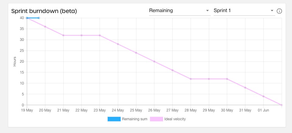
The final step is to generate your burndown chart. Once the sprint has commenced, everyone in your team should be tracking their time against their allocated tasks and tracking when they have completed a backlog item. On the Y-axis, you will see the planned work to be completed in the sprint. On the X-axis, you will see the dates in the sprint.
For this example, let’s say you've estimated the team will complete 50 story points in a two-week sprint. In an ideal world, your team would be working at a rate of 5 story points per working day. This ideal velocity is tracked on the graph, progressing steadily move from the upper left-hand corner to the lower right as the days go on, providing a guideline.
In reality, work never runs to such a strict schedule. One day may be more productive than another, or the effort required to complete a specific task may have been underestimated. As your team works through the backlog and items are ticked off the list, this will be visible on your graph as a line that tracks the remaining sum, which should decrease as the sprint progresses. The goal is for the burndown chart to reflect your team’s steady progress throughout the sprint until the Remaining Sum reaches zero as close to the projected end date as possible.

The benefits of a burndown chart
There are many benefits to tracking your progress in a burndown chart. Let’s look at a few:
- A visual representation of scope creep: A factor that can impact your burndown chart is scope creep. While changes to scope are to be expected, consistent scope creep can quickly derail a sprint. If a new user story is added to your product backlog, this should be tracked and will show up on your chart as an increase in remaining work. When you use a burndown chart, the Remaining Sum line should be steadily tracking down; if this value is frequently increasing, too much work is being added to the Sprint.
- A better understanding of sprint velocity: If your line is flat for most of the sprint before suddenly dropping off at the end, this could be a sign that your User Stories are too large or complicated. While not all User Stories will be equal in complexity (that’s what story points calculate), it shouldn’t take your team the entire sprint to complete just one. Equally, this could be indicative of poor productivity; either way, it opens up a conversation about workload and efficiencies.
- Early warning of bottlenecks: If your burndown isn’t, well, burning down, that could be an indication that your team is reaching a bottleneck. Keeping an eye on progress can help you note issues before they arise.
- More accurate planning in the future: Once you’ve completed several sprints and have a number of burndown charts to refer to, you can take learnings from this to apply when future planning future sprints. For example, you may be allocating too much time to tasks or underestimating how many story points your team can complete during a sprint.
- A visual representation of work completed: It feels good to see your hard work paying off. As much as burndowns are a useful tool for making more accurate estimates, they’re also great for motivating the team. Everyone wants to see that they’re on schedule with only 5 story points left to complete!
What is the difference between a burnup and a burndown chart?
A burnup chart is relatively similar to a burndown chart. The main difference is that it tracks work completed rather than work remaining. This chart shows how much work has been completed versus the sprint’s total scope.
Another key difference is that burnup charts are better at representing scope creep. While scope creep is visible on a burndown chart, as mentioned above, it’s clearer on a burnup chart. This is because it includes a separate line reflecting the total scope; if 5 story points are added to the scope, this is made abundantly clear.
How do you create a burnup chart?
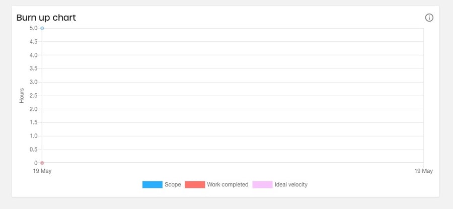
Similar to the burndown chart, on a burnup chart, time is tracked along the X-axis, with the Y-axis measuring progress. Unlike a burndown chart, the line tracking progress moves steadily upwards towards the upper right-hand corner.
The first metric tracked is the total scope. If new deliverables are required, this should be reflected in your burnup chart by increasing the value of the total scope at the point the scope has been increased.
The second metric is the work completed. As you work through your sprint backlog, this is tracked on the graph, with the value of work completed growing over time. By the end of the sprint, the lines tracking the total scope versus the work completed should meet. This will signal that all the story points have been completed within the expected timeframe.
Finally, as with a burndown chart, this will run alongside a line that represents the ideal velocity your team should be aiming for. By reviewing the work completed to the ideal velocity at any point in the sprint, you can quickly see whether you’re ahead of or behind schedule.

How to use burndown and burnup charts in Agile & Scrum
Using these two charts collaboratively can be useful in providing a complete picture of how the project and individual sprints have progressed. A burndown chart is helpful for project teams to understand whether they’ll hit their goals or not; a burnup chart can help add context when reviewing progress with stakeholders as it clearly represents how scope changes have affected a project.
How Forecast can help you track your progress effectively
Advanced Analytics (AvA) from Forecast gives you all the tools you need to quickly, accurately, and easily review your business’s data.
Forecast creates customizable visuals that give you instant insight into your performance metrics. Real-time insights are based on your real-time work; the platform tracks your team’s time registrations against your planned story points. When you’re behind schedule, Forecast automatically lets you know, making it easier than ever to stay on top of your sprints.
Try Forecast out for yourself by signing up for a free trial below.
You might like to read these articles on our blog..

Unleashing Operational Excellence: A Strategic Imperative for Professional Services Leaders.
Read moreFrom Vision to Execution: How Operational Excellence Drives Success in Professional Services
Read moreMaster Project Budget Management with Professional Services Automation
Read moreSubscribe to the Forecast Newsletter
Get a monthly roundup of productivity tips & hacks delivered straight to your inbox